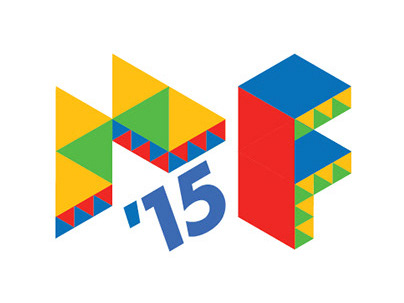

A symbol for Fast, Easy,
Reliable & Trendy
Freecharge came to FOLO with the requirement to redesign their identity. We interpreted the brief as translating the most customer-relevant values of a platform like Freecharge visually.
Based on interviews that we conducted with many users of mobile phones, we deduced that it mattered to them that the service that they used to recharge their phones or pay bills is fast, easy and reliable. An added keyword that came up in the conversations with the yuppies was 'trendy'. Goes without saying, why.

The feature Freecharge wordmark
The lightning F
What we needed apart from the wordmark was a symbol that stood by itself and could be useful for Freecharge's mobile app and other 'mini' application scenarios. We found that fairly easily in the concept of lightning which paired itself with the 'F'.

The abstracted lightning 'F' which became the iconic Freecharge 'F'
CREDITS
Logo Design & Art Direction: Aditya Dipankar
Brand Book Design: Veethika Mishra