Letting the brilliant shine
When the content is brilliant, all the design has to do is get out of the way. That has been the philosophy which design for PARI (People's Archive of Rural India) has been approached since day 1. Print has been no different.
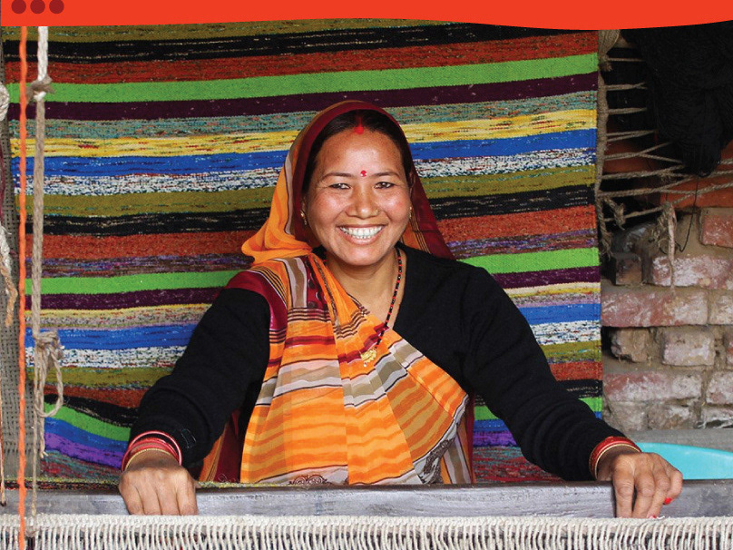
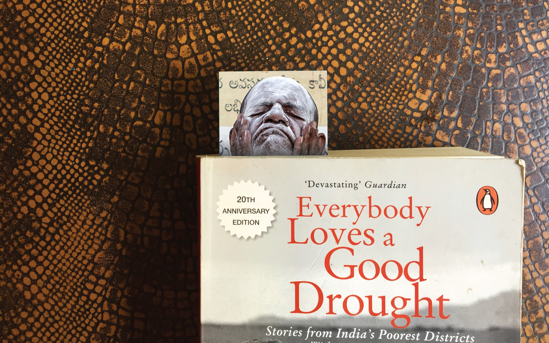
PARI is a treasure of rich imagery which succinctly describes India and it's countryside. Almost every image in-use on the site speaks volumes about the subject and the story. This is what was 'used' in the print collaterals that have been designed so far.
3 print artefacts have been designed: a brochure, bookmarks and a visiting card.

Cover/Front side of the PARI brochure
Additionally, the opportunity that our print collateral gave us was to request for donations. The bookmark and the brochure carry a gentle call to donate with them, tucked in a side.
Inside of the brochure
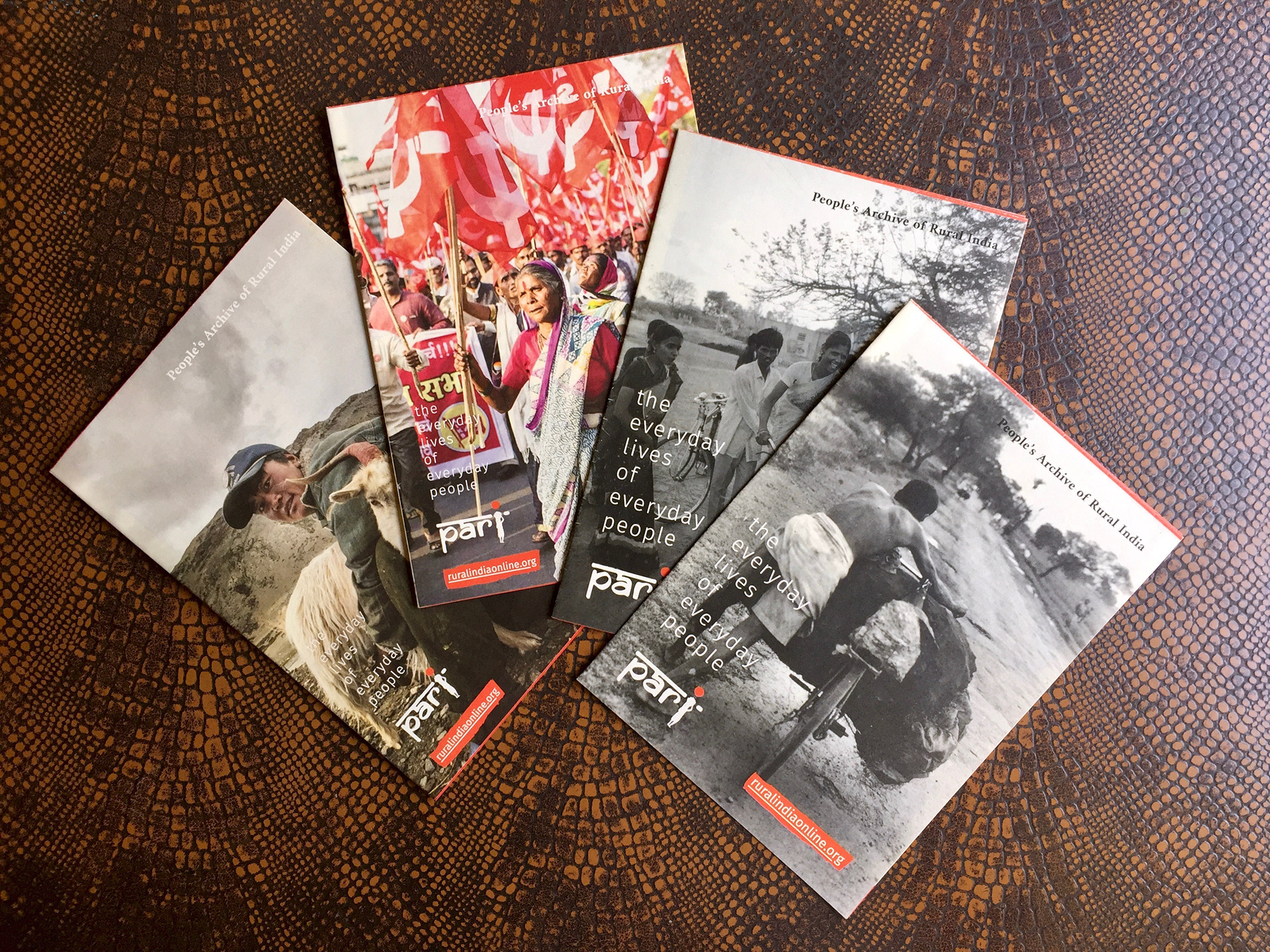
Some prints of the brochures
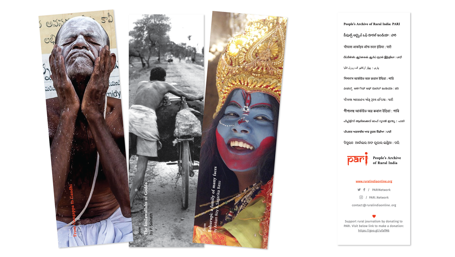
PARI Bookmarks with the back-side saying 'People's Archive of Rural India' in 12 Indian languages
The PARI cards became an interesting play with typography and photography. Additionally, team members were allowed to choose their favourite photograph from the archive and have it printed on their card.
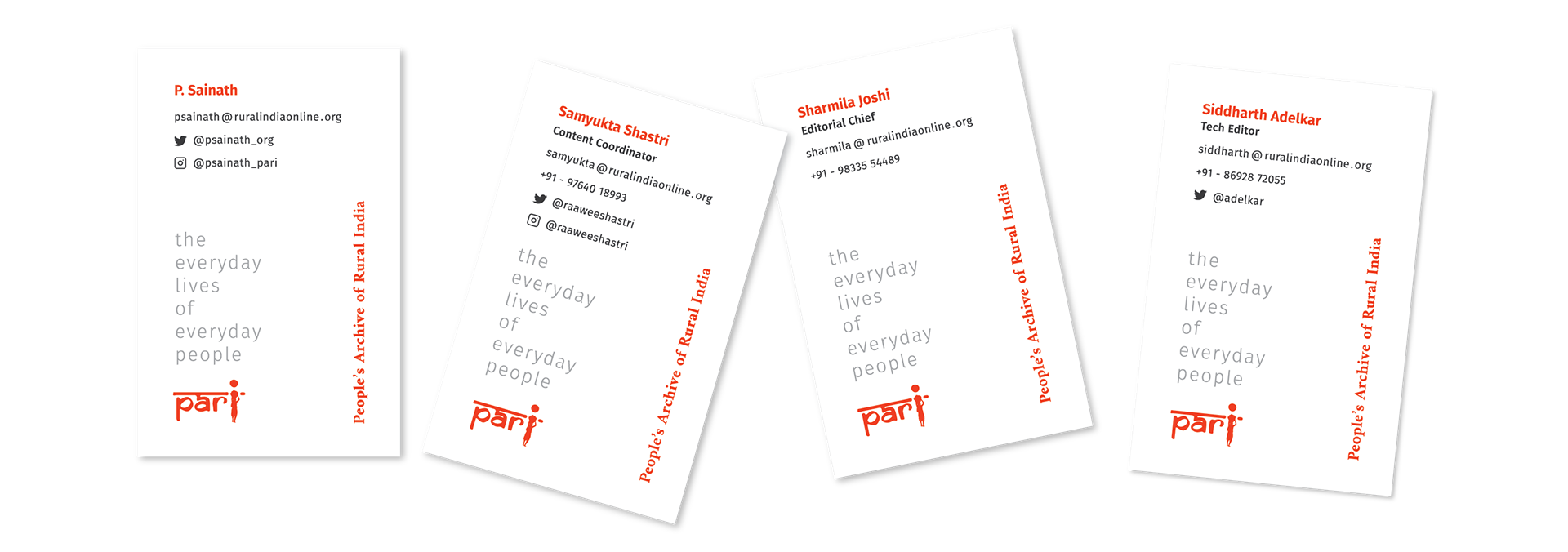
Front side of the cards with personal details of team members
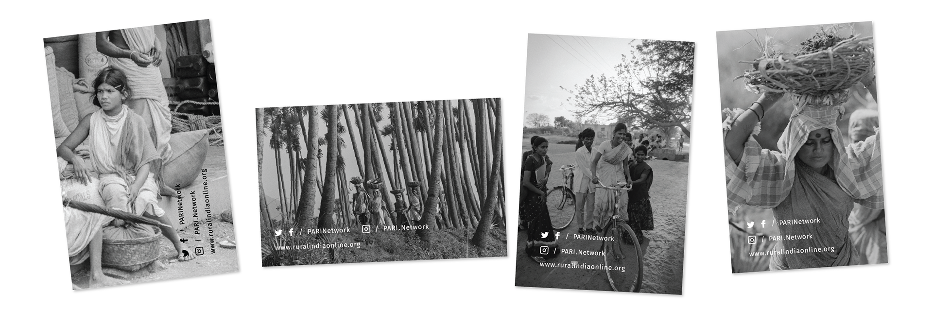
Back side of the cards with photographs of team members' choice